
 How to resolve AdBlock issue?
 What is cart and browse abandonment?

"Browse abandonment emails are straightforward, focused, real-time emails to offer help and call shoppers back. They are different from newsletters, and marketing brochures, and other types of abandonment emails."
1. Shoppers on your website take a quick look around.
2. Then they look at products. If they leave at this stage, as most do, it's called browse abandonment, and sending browse abandonment emails to call them back gives you 3.5% sales uplift on average. These emails are what this post is all about.
3. Finally shoppers put products into their shopping carts, go to the checkout page and buy. If they leave during any of these steps, it is called cart abandonment, and sending cart abandonment emails to call them back gives you 8% sales uplift on average.
So, browse abandonment and cart abandonment emails target shoppers who leave at different stages in the sales funnel. If you send both types, properly designed, you get 11.5% sales uplift on average. Omit either and you're leaving money on the table.
Browse abandonment emails are straightforward, focused, real-time emails to offer help and call shoppers back. They are different from newsletters, and marketing brochures, and other types of abandonment emails.
So how do you design one of these emails? Here's a guide and some examples to help you. A good browse abandonment email has the following design features:
-
Easily recognisable in the in-box, so recipients will open it - ie from the sender, subject and pre-header. These must identify the brand, the purpose of the email (e.g. ‘Thank you for visiting’ or, ‘Did you need any help?’) and possibly include the name of one viewed product.
-
Content must be clear and simple. The reader must ‘get it’ in two seconds. It's especially important to keep a light touch, because you are dealing with a repeat visitor (otherwise how do you have an email address?) but they have not chosen a specific product this time and so their engagement may be low.
-
Follows your website branding and tone of voice.
-
Shows one or more of the viewed products - using content from the abandonment system. These products are shown as if in a catalogue, not a shopping cart.
-
Includes related product suggestions - using content from the abandonment system
-
Has a strong, clear call-to-action that links to your checkout process, or one call-to-action per product, so it's easy for shoppers to click and return.
-
Does NOT have basic personalisation, e.g. "Dear Steve Jones". This is controversial. Some marketers strongly recommend it; some think it's been over-used by spammers. We think it's best avoided for browse abandonment emails, because engagement may be low and personalisation may come across as creepy. But you know your customers best, so make up your own mind.
-
Has a navigation bar. This is also controversial. We recommend it for browse abandonment emails, because shoppers won't necessarily want to return to a specific product. Again, make up your own mind.
-
May have an unsubscribe link. Most abandonment emails don't have them, because it's not usually a legal requirement for transactional emails (this is just a blog post, not legal advice). We recommend that you do have an unsubscribe link at the bottom, because it's polite and it avoids people using the spam button to unsubscribe. But basically you decide.
Here are some great examples of browse abandonment…
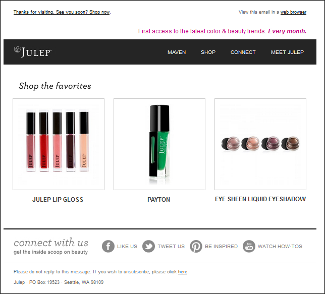
A beautiful, minimal example from a beauty company. Just recently viewed products and standard navigation. Note the emphasis on images and the lack of prices, because this email looks like a catalogue page.
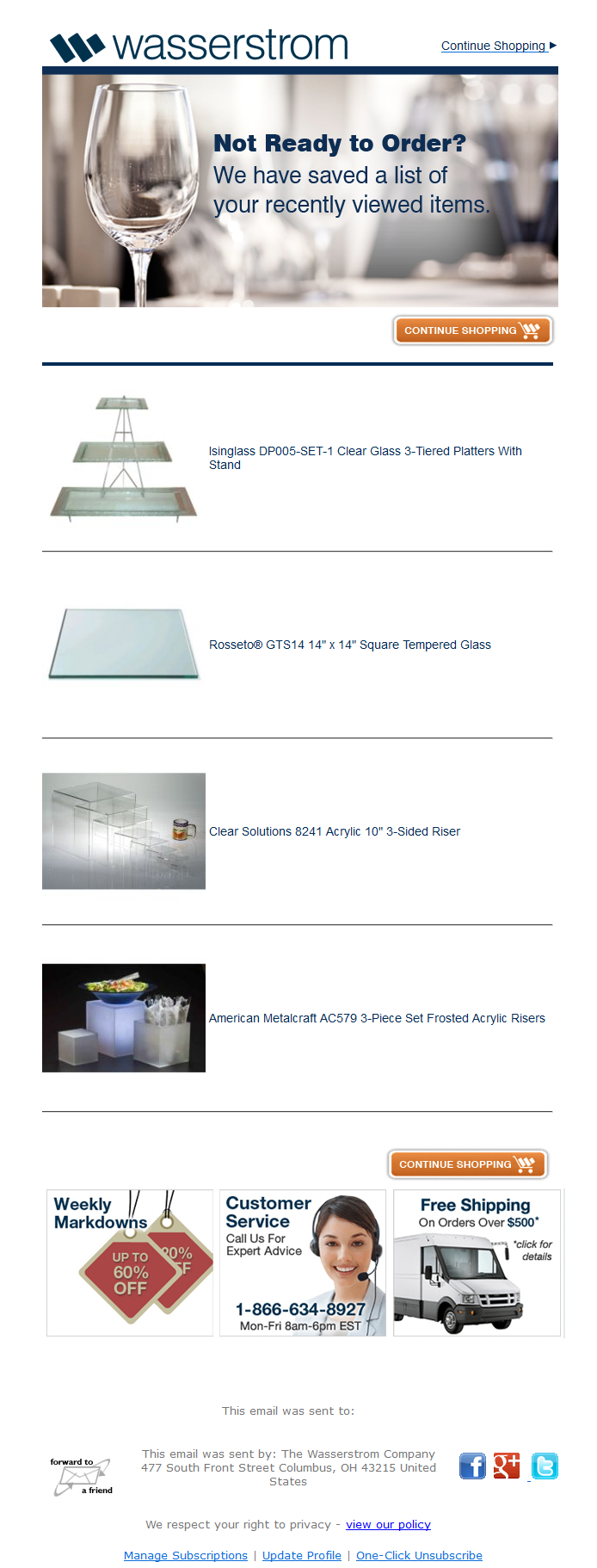
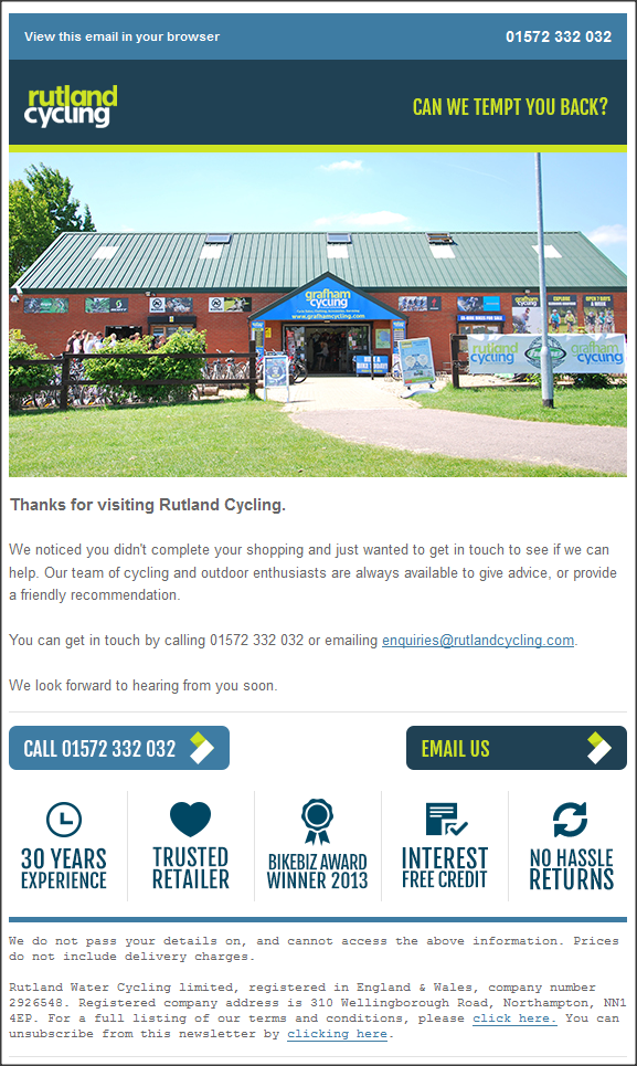
Classic browse abandonment email, with all the normal components: company branding at the top, explanation of why the email was sent, call to action to continue shopping, recent product details, company USPs, and a standard footer.
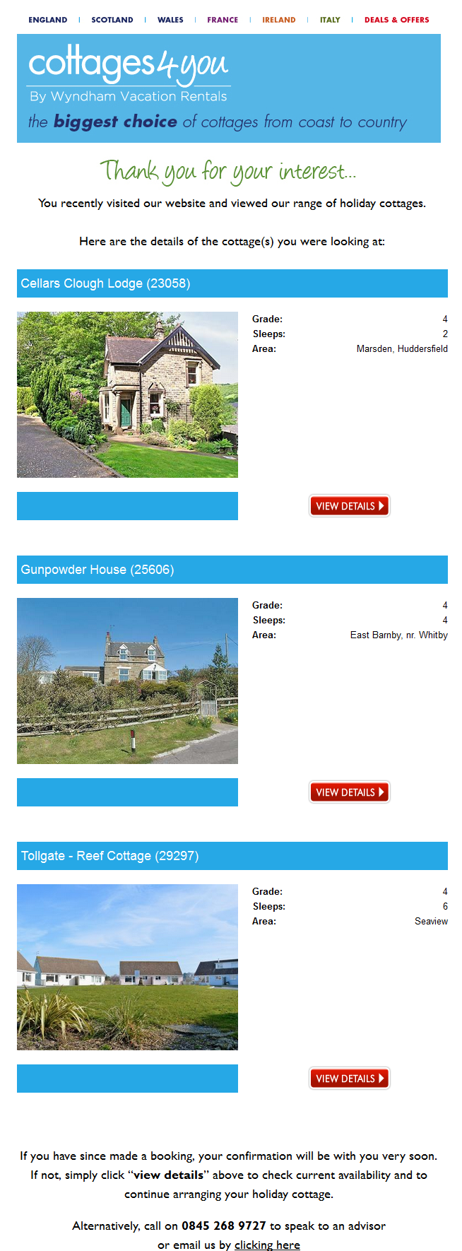
Another classic browse abandonment email, featuring great pictures of holiday locations. There's no single call to action, but a separate button to return to exactly that holiday, which makes sense as they are complicated products and you will probably only buy one at once.
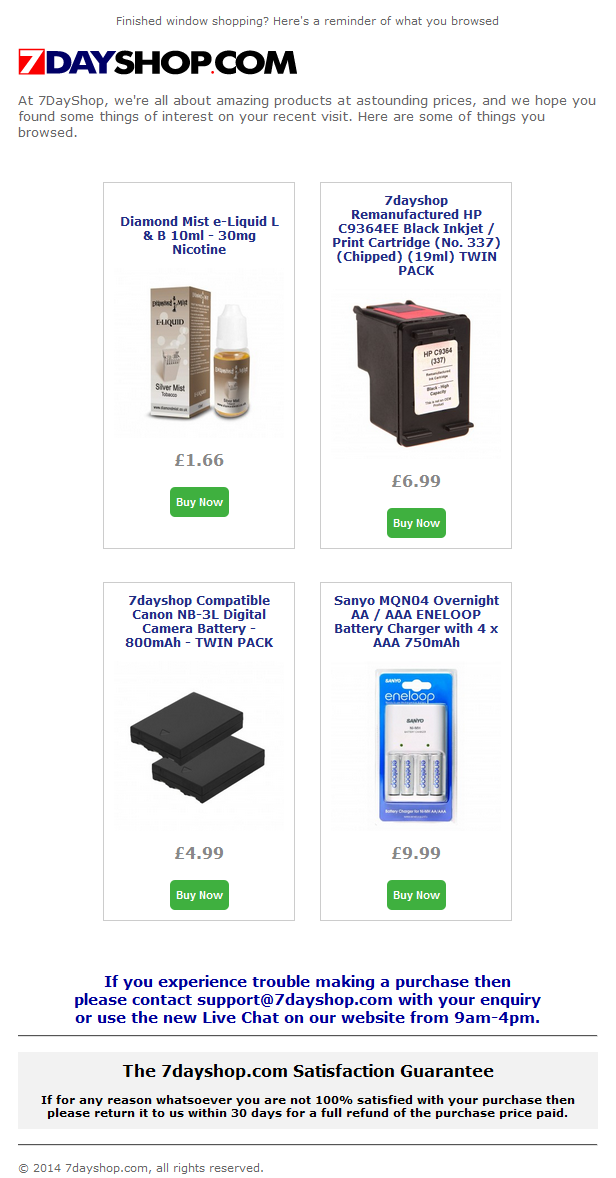
A clean, no-nonsense browse abandonment email from an electronic retailer. This email features prices in larger font, because "the lowest possible prices" is one of their USPs.
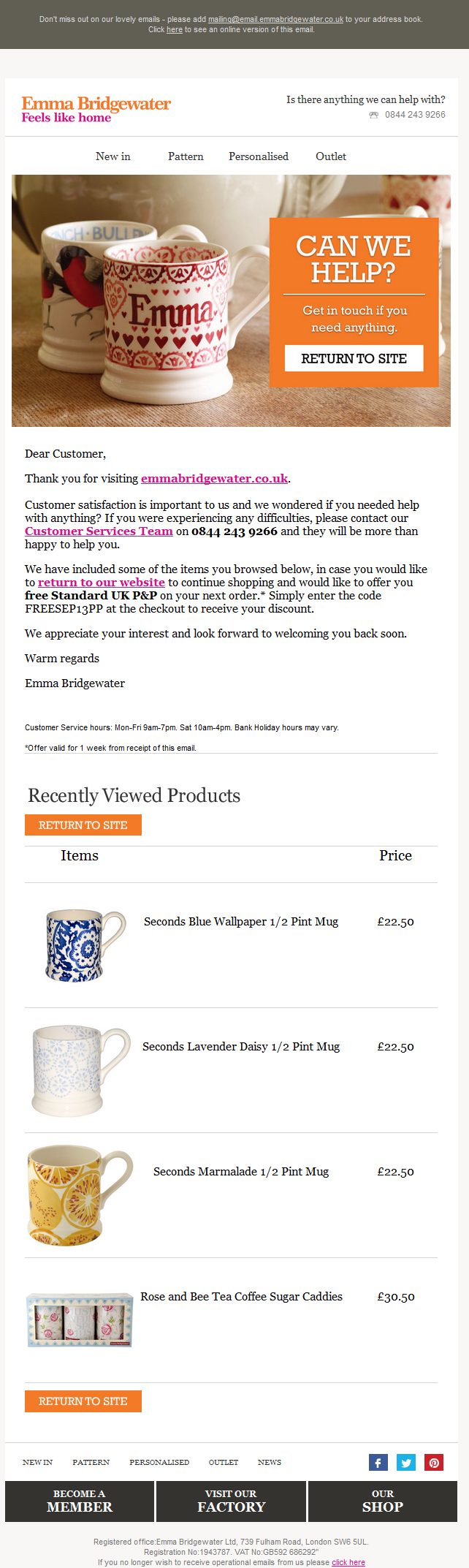
Pleasant, conversational email which looks like a personal letter from a friend. All the necessary components are there: company branding at the top, explanation of why the email was sent, recent products, company USPs, calls to action and the standard footer information.
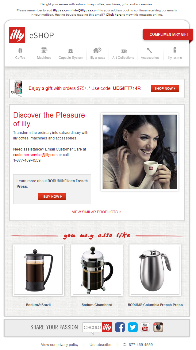
A beautiful example from a high-end coffee retailer. Note that they feature a single browsed product (the one you've look at most often), so they can show it alongside a great picture. This is the first example to include a feed of suggested products.
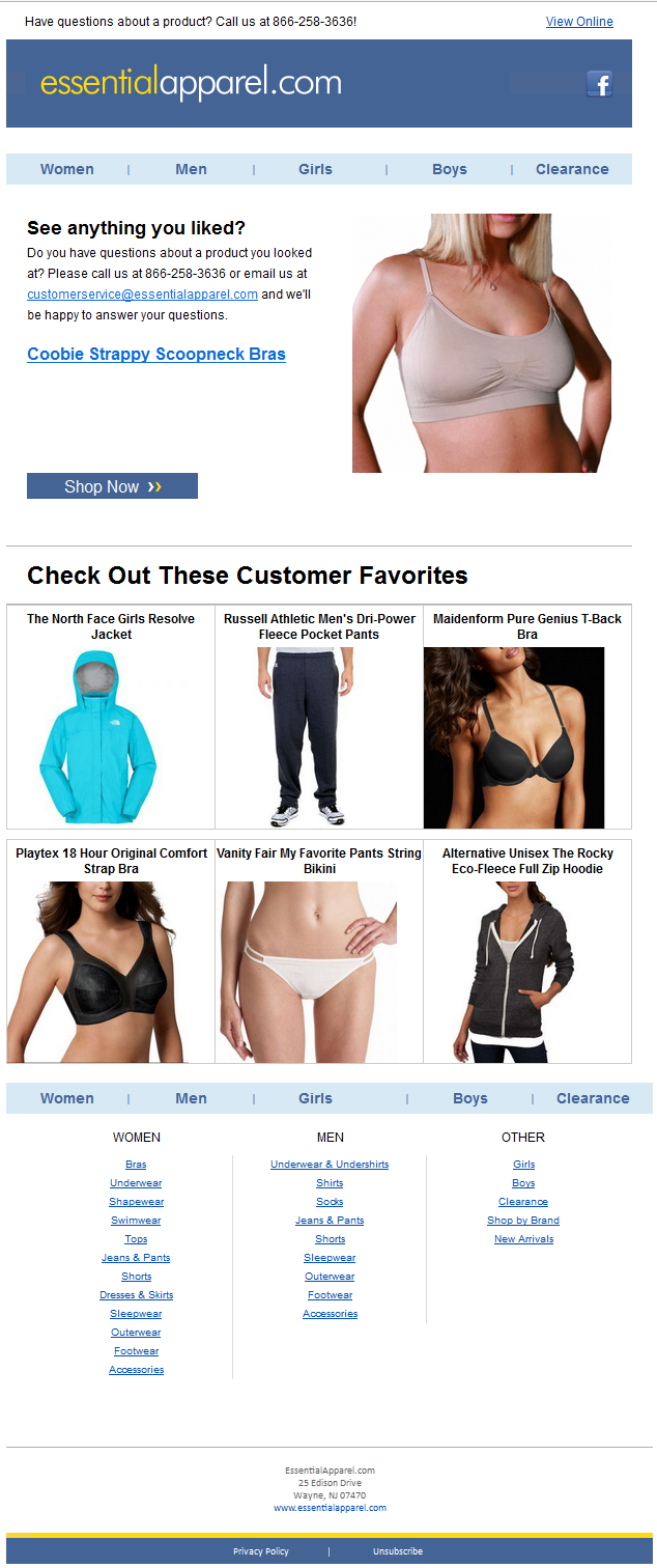
Image-rich email from a clothes site that shows a single browsed product (the one you've look at most often), so they can use a large picture. Then there's a feed of suggested products, and a large footer with navigation links.
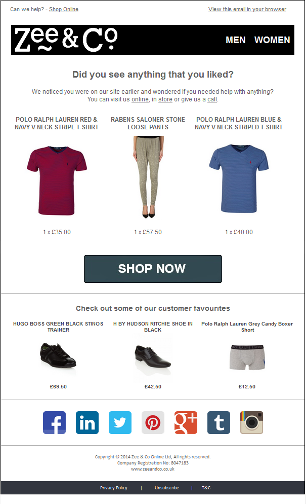
Strong branding from another clothes store, showing three recently-browsed products, a feed of suggested products, and a large footer with social links.
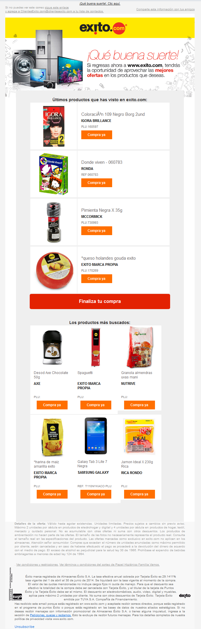
From the inimitable Exito of Columbia, which is huge and sells everything, an enthusiastic welcome and promise of great offers. Content includes a feed of suggested products. The footer is huge, but this doesn't matter much because repeat visitors won't scroll all the way down.
Finally, an attractive email from a recent client, that demonstrates you can get good results without any personalisation. The most important things are that the emails look good and get sent. Once they’re sending, test different creatives and see what works best for you.