
 How to resolve AdBlock issue?
 Do you need to go skinny for mobile?

Do you need to go skinny for mobile? There's a huge variety of screen resolutions to design for. Putting aside fluid layouts, how wide should a fixed width email be? According to DeviceAtlas, the four most common mobile device widths are 240px, 128px, 176px and 480px wide (320px is 6th, 640 is 16th). However, when we look at the latest mobile email stats from Litmus and Return Path, the iPhone dominates.
Litmus based on 630 million opens iPhone - 6.75% Android - 1.1% iPad - 1.06% Blackberry - 0.05%
% of all email received in 2011 by Return Path iPhone OS 4 - 9.58% iPad - 2.56% Android 2 - 2.08% iPhone OS 3 - 1.34% Assuming your stats reflect this trend, your email template needs to cover a 320 - 1024+ pixel range.
Pick a number between 320-640px
The iPhone3 has a device width of 320px, the iPhone4 640px. Not surprisingly, recommendations are within this range:
640px is the new sweet spot for #email width; double the display width on #iphone #interact2011 #responsysConsider using a single-column approach (about 320px) - Justine Jordan, Litmus 2011
Reduce to 450, 500, 525 - Matthew Caldwell, Yesmail #EEC 2011
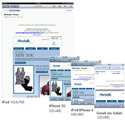
Arguably everyone is right, as the iPhone scales content to fit the device width. Check out this 2415px wide A&F email:
iPhone 3G 320px wide

iPhone/iPod 4 640px wide
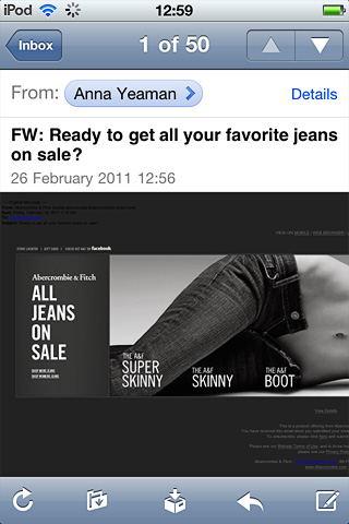
While you can send a 2415px email to iPhone users, 320px is still optimal.
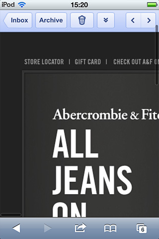
Via the browser
Many users access email via Safari on the iPhone. Litmus puts it at 1.5 million views (0.23%) out of 630 million. When you access webmail via a browser, only a 320px wide portion is displayed on the iPhone. For this reason, a 320px wide layout offers the best coverage.
Gmail via Safari
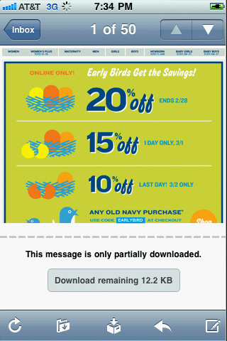
File size
If 320px is too much of a cull, consider 480px to keep file size to a minimum. The W3C advises mobile emails be under 20K. Old Navy's 835px wide template below is around 150K.
Android - another reason to go skinny
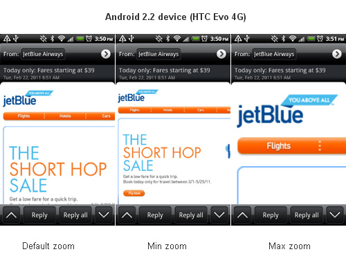
In order to future-proof your mobile strategy, don't exclude the Android. You have more droid users than you think, images are blocked by default so usage stats are understated. The Blackberry also has spotty image support, now that the Blackberry6 is using webkit usage will go up. Unlike the iPhone, the Android does not scale content to fit the display. The Android 2.2 device (HTC Evo 4G) below has a 480px wide resolution. When displaying a 580px wide jetBlue email, only a 330px wide portion is visible. To make navigation more difficult, the min/max zooms are limited:
This Nielsen study found that a smaller screen, "hurts comprehension". We have to rely more on our short-term memory when scrolling and less context equals less understanding. With poor image support and visibility, aim for 320px. If nothing else, optimize the top left section of your template to contain all the critical information in HTML.
Skinny not a silver bullet
While 320px is the best compromise for mobile email, I've yet to see it widely adopted for the desktop. Marshalls and TJ Maxx are the only retailers to go skinny at 460px and 520px.
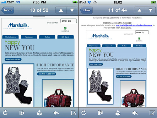
Marshalls pre-header table is wider than its content, forcing the email to be zoomed out (right). Once I set the table width to match the content (left), it was easier to read but still too small. I can't decide if leaving a save path for scrolling on either side was on purpose. What do you think? While I give Marshall's kudos for experimenting, a skinny template is not a silver bullet. The size and simplicity of your content in relation to width, determines readability.

Mobile first
By end of 2011 50% of Yahoo mail users will access mail thru mobile #inboxlove - @advenix
We need to reinvent email for mobile, rather than port the desktop version. Shaving off 100px is a start, but the best approach is to design for mobile first. Doing so creates a better desktop experience, as device limitations force a lean, focused design without the fluff. In the last year I've deployed 320px, 380px, 980px and fluid emails, targeted at the iPhone and desktop. Mobile usage is up from 4-20%, performance is better than ever. As mobile usage stats increase, designers will need to take a more aggressive approach. Experimenting with fluid layouts and images (defined in %), responsive layouts (media detection), dynamic content (adjusts to device in real-time), device specific (iPhone vs. Blackberry) and yeah even a few 320px layouts. I can't wait.
When you subscribe to the blog, we will send you an e-mail when there are new updates on the site so you wouldn't miss them.